Rich Black CMYK Test
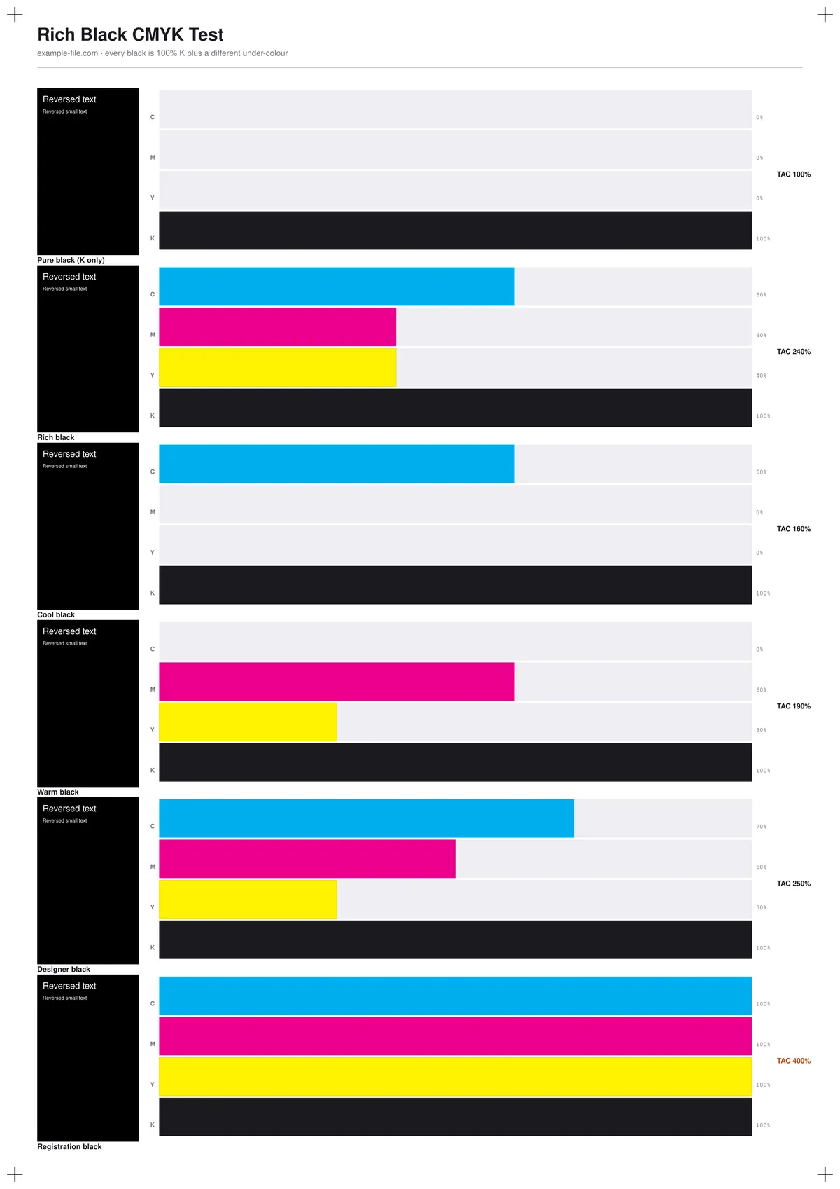
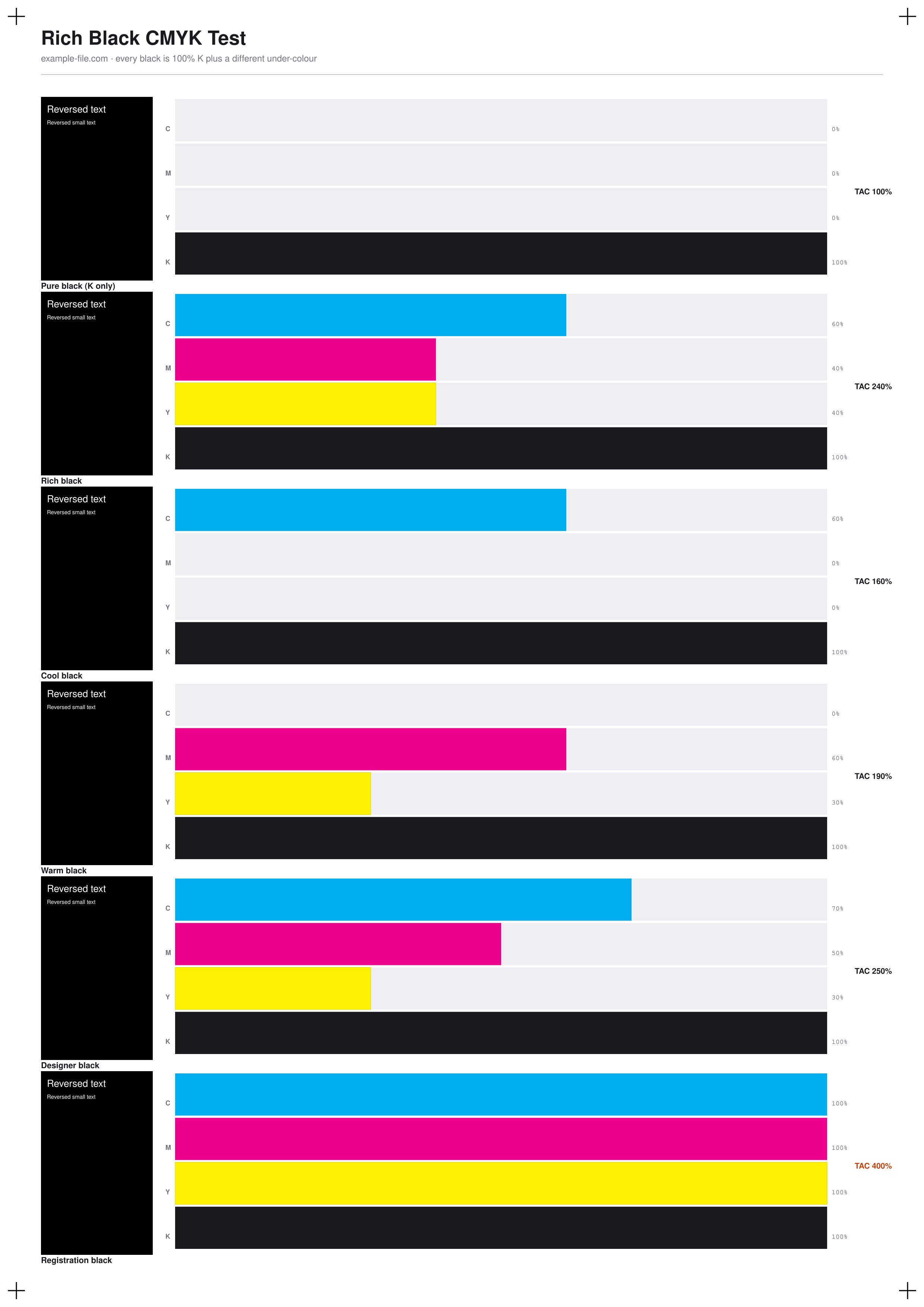
Six different ways to make black, printed side by side so you can decide which one your job actually needs. Each patch is a true DeviceCMYK build - pure K-only, the standard rich black, cool and warm variants, a deep designer black, and registration black - labelled with its exact ink percentages and its total area coverage. Every patch also carries reversed-out text at 8pt and 5pt, because misregistration on a four-ink black shows up around small type long before you notice it anywhere else.
What these files actually are
The PDF patches are real DeviceCMYK, drawn with pdf-lib's CMYK operators, so Acrobat's Output Preview or a RIP reads back exactly the values printed on the labels. The PNG cannot show you the difference and does not pretend to: convert any of these formulas to RGB and all six collapse to the same black, because a screen has no way to represent ink mixes. So the PNG charts the ink each formula lays down instead of faking a visual difference - the patches in it are honestly identical.
-
Downloadrich-black-test-a4.pdfPDF · 2.5 KB VirusTotal report
-
Downloadrich-black-test.pngPNG · 272 KB VirusTotal report
Are these files safe to download?
Every sample file is generated by us — no executable code, no macros. Files are served over HTTPS from our CDN, each with a SHA-256 checksum so you can verify your download and a link to an independent VirusTotal scan report.
Check this site independently:
How to print this test sheet
- Print the PDF at 100% scale on the paper stock you'll actually use - rich black on uncoated stock looks nothing like rich black on gloss, because the extra ink soaks in rather than sitting on the surface.
- Look at the patches under neutral daylight, from a normal reading distance, and compare them against each other rather than against your memory of "black". The differences are real but they are subtle.
- Check the reversed 5pt text on each patch. On K-only it should be clean; on the four-ink blacks any registration error shows as coloured fringing around the letters. That is the single best argument for keeping small text K-only.
- Read the TAC number on each patch before you use its formula. Registration black is 400% and will not dry properly on most presses - it exists for crop marks, not artwork.
- If two patches look identical to you on your stock, choose the one with lower TAC. There is no prize for using more ink than the job needs.
- To inspect the underlying values rather than trusting the labels, open the PDF in Acrobat and turn on Output Preview - hovering a patch reports its real ink percentages.
Common use cases
Choosing a black for a specific stock
Print the same six formulas on the paper a job will actually run on, then pick by eye rather than defaulting to whatever the last project used.
Diagnosing washed-out or muddy blacks
Compare a print against known formulas to work out whether a disappointing black is a design choice (K-only over a large area) or a press problem.
Settling the small-text argument
Show a colleague or client the reversed 5pt text on rich black versus K-only, on a real proof, instead of explaining registration in the abstract.
Checking a press or proofer's ink limit
Use the TAC labels to find where your press stops coping - the point where a higher-coverage patch stops looking better and starts looking wet.
Frequently asked questions
- Why do all six patches look exactly the same in the preview image above?
- Because they are the same on screen, and the preview is honest about it. A display emits red, green and blue light; it has no way to show that one black is 100% K and another is 100% K plus 60% cyan underneath. The difference only exists once ink meets paper. That is why the PNG charts ink percentages rather than pretending to show a visual difference.
- What actually is rich black?
- Black ink alone often looks slightly washed out across a large area, because a single ink layer doesn't fully cover the paper. Rich black adds cyan, magenta and yellow underneath to deepen it - typically 60/40/40/100. The trade-off is that you now need four inks to land in exactly the same place.
- Should I just always use rich black then?
- No. For body text, thin lines and anything small, K-only is safer: it uses one ink, so registration can't fringe it. Rich black is for large solid areas where the extra depth is visible and small misregistration isn't. The chart is designed to let you see both cases on one sheet.
- Why is registration black on the chart if I should never use it?
- Because people use it by accident - it's often the swatch sitting right next to black in a design app's default palette. It exists so that crop marks print on every separation plate. At 400% coverage in artwork it will not dry, will offset onto the next sheet, and may be rejected outright by your printer. It's here so you can recognise it.
- Is the TAC limit on this chart right for my printer?
- The chart reports each formula's TAC; it doesn't know your press. Sheet-fed offset on coated stock commonly tolerates around 300%, web offset on newsprint far less, and digital presses vary widely. Treat the numbers as facts about the file and ask your printer for their limit.
More printer test images
- CMYK Printer Test Chart — Free Ink Patch Chart (PDF/TIFF)
- CMYK Test Image — Free 4-Channel CMYK JPEG & TIFF Download
- Ink Test Page — Free Printable Ink Coverage Test (PDF/PNG)
- Printer Test Image — Free Printable Test Page (PDF/PNG)
- RGB vs CMYK Test Image — See Real Color Conversion (PNG/TIFF)
- Bleed Test File — Free Print-Ready 3mm Bleed PDF (A4)