RGB vs CMYK Test Image
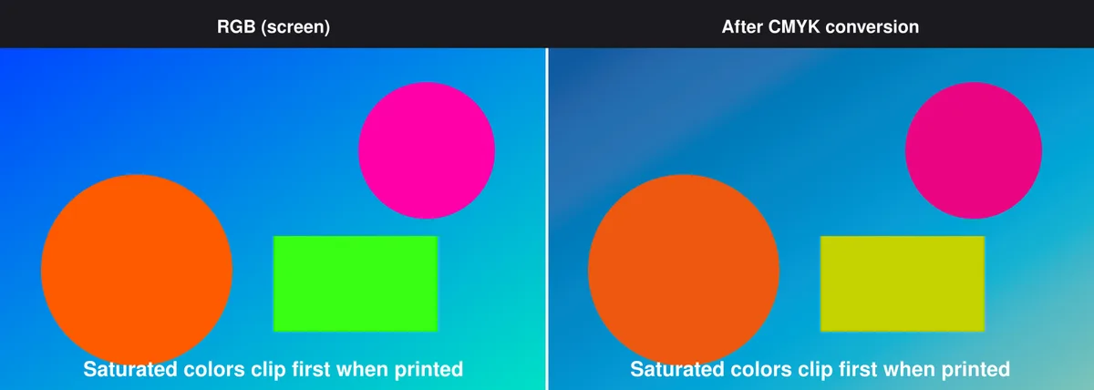
A vivid, saturated scene converted through a real RGB-to-CMYK color-space transform, shown as a direct side-by-side comparison of the same region before and after conversion - so instead of just being told that printed colors shift, you can see exactly how much and in which direction.
What these files actually are
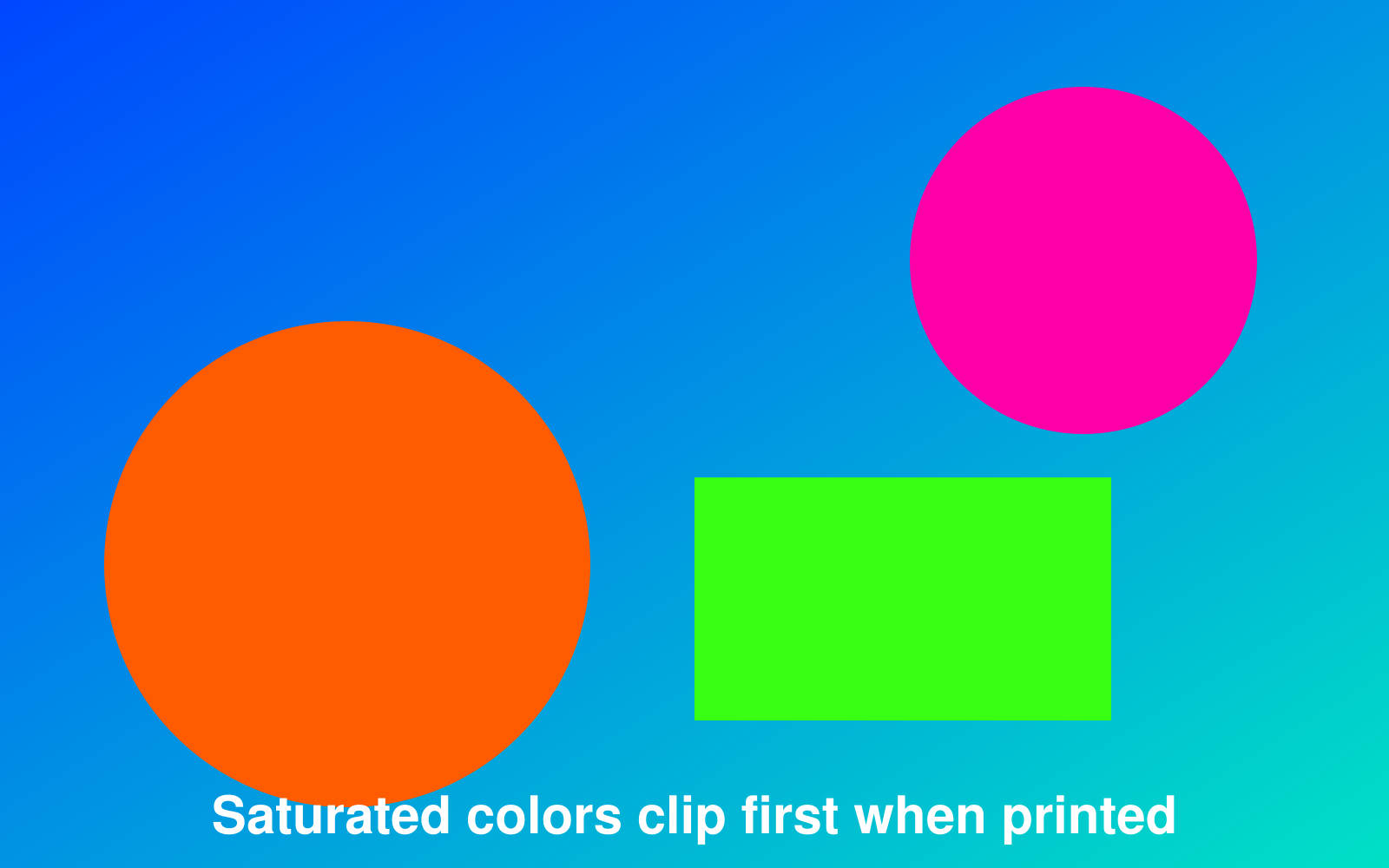
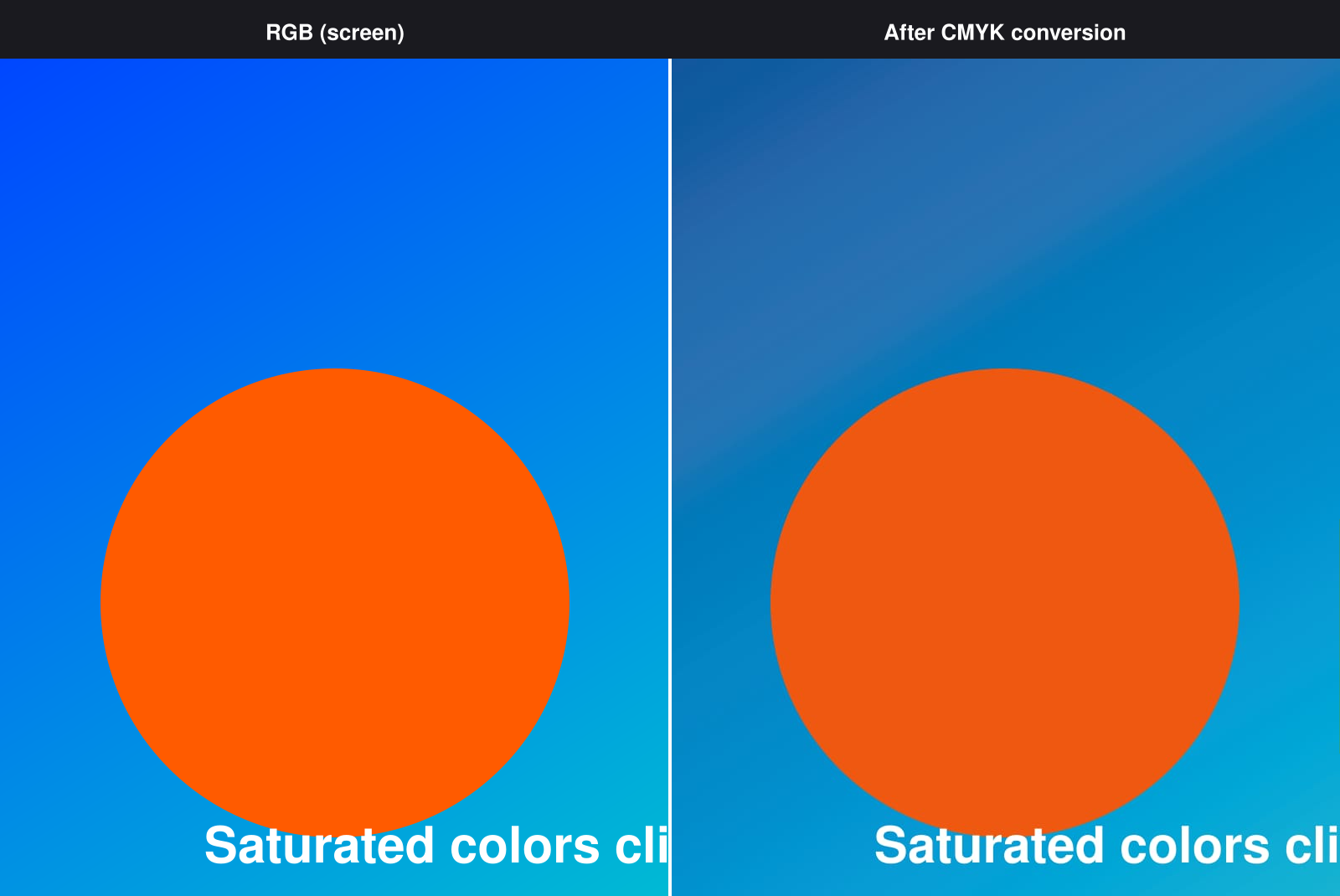
The conversion is real, not a simulated color overlay: the source PNG is genuinely converted to CMYK color space with Sharp, then converted back to sRGB for the comparison image so the shift is visible on a normal screen. The CMYK TIFF you can download is the actual converted file, not a preview rendering.
-
Downloadrgb-vs-cmyk-source.pngPNG · 112 KB VirusTotal report
-
Downloadrgb-vs-cmyk-cmyk.tiffTIFF · 84 KB VirusTotal report
-
Downloadrgb-vs-cmyk-comparison.pngPNG · 189 KB VirusTotal report
Are these files safe to download?
Every sample file is generated by us — no executable code, no macros. Files are served over HTTPS from our CDN, each with a SHA-256 checksum so you can verify your download and a link to an independent VirusTotal scan report.
Check this site independently:
How to print this test sheet
- Start with the comparison image - it's the fastest way to see which colors held up and which ones shifted, without needing any special software.
- Saturated, vivid colors (bright oranges, magentas, greens) are the ones most likely to shift, since they often fall outside what CMYK ink can reproduce - this is called gamut clipping.
- Open the CMYK TIFF in an image editor that supports CMYK mode (like Photoshop) to inspect the actual converted channel values, not just how it looks.
- If you're designing something meant for print, use this as a reminder to soft-proof in your design software rather than trusting the RGB preview on screen.
- For per-channel ink patch testing rather than a whole-image comparison, see the CMYK printer test chart.
Common use cases
Explaining color shift to clients or students
A single side-by-side image that makes the abstract concept of gamut clipping immediately visible, useful for design education or client conversations about "why doesn't my print match my screen."
Testing an app's color-space conversion
Run this file through your own image pipeline or app and compare the result to this reference to check whether your CMYK conversion is behaving as expected.
Soft-proofing habit check
If this comparison surprises you, that's a sign it's worth building a soft-proofing step into your design workflow before sending files to print.
Choosing print-safe colors for a design
Use the visible clipping in this example as a reference point for how saturated a color can safely be before a print run mutes it more than expected.
Frequently asked questions
- Why do only some colors shift and not others?
- CMYK ink can't reproduce every color a screen can display - it has a smaller gamut, especially for very saturated colors. Colors already close to what CMYK can print shift very little; highly saturated colors near the edge of RGB's gamut clip the most.
- Is the CMYK conversion calibrated to a specific printer?
- No - it's a generic, uncalibrated conversion, not matched to any particular printer's ICC profile. Real-world results will vary by printer, ink set, and paper; this demonstrates the general phenomenon, not a prediction for your specific setup.
- Can I use the comparison image itself for anything besides viewing?
- It's built for visual comparison, not as a source file for further editing - use the separate source PNG or CMYK TIFF if you need clean image data to work with.