Photo Printer Test Image
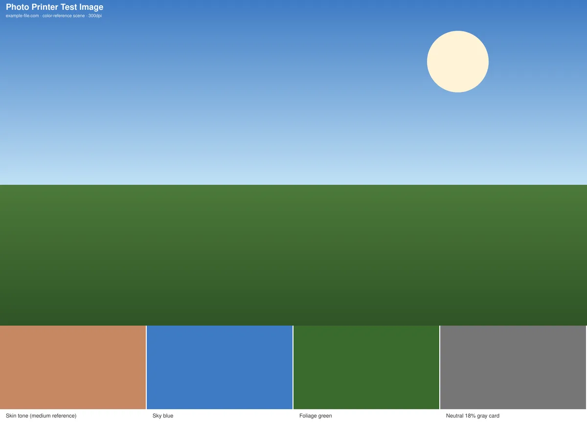
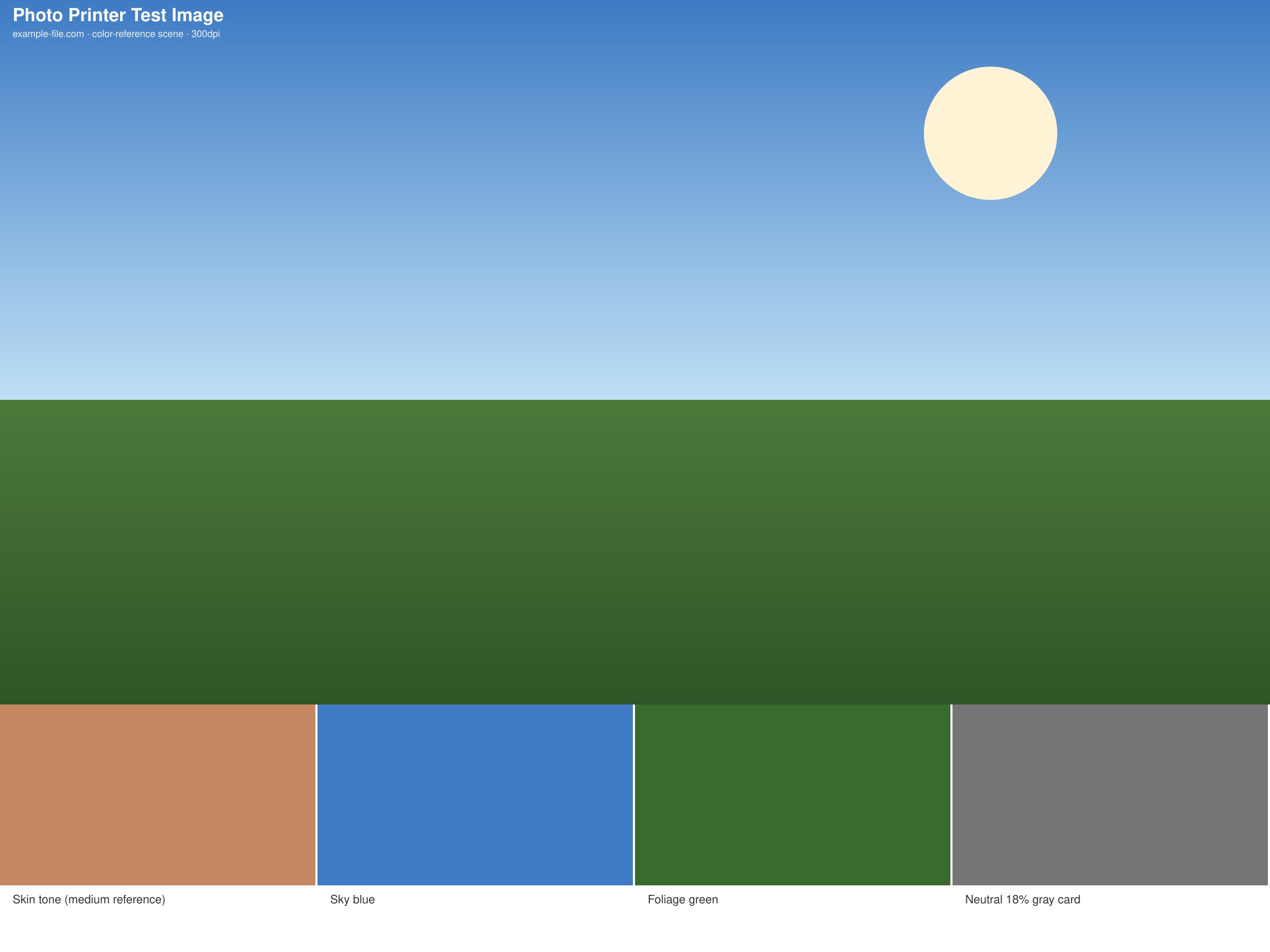
A 300dpi reference scene built around four labeled color patches that real-world photos lean on most: sky blue, foliage green, a medium skin-tone reference, and a neutral 18% gray card - the same kind of subjects photo labs and camera reviewers check first for accurate reproduction.
What these files actually are
This is a generated color-reference scene (a gradient sky, a solid foliage band, and four labeled swatches), not an actual camera photograph - each swatch is a flat, labeled reference color rather than a real-world captured subject, so you know exactly what value you're comparing against. Both files are rendered fresh at 300dpi with Sharp.
-
Downloadphoto-test-scene.jpgJPG · 108 KB VirusTotal report
-
Downloadphoto-test-scene.tiffTIFF · 63 KB VirusTotal report
Are these files safe to download?
Every sample file is generated by us — no executable code, no macros. Files are served over HTTPS from our CDN, each with a SHA-256 checksum so you can verify your download and a link to an independent VirusTotal scan report.
Check this site independently:
How to print this test sheet
- Print on the actual photo paper you intend to use - color response varies significantly between glossy, matte, and plain paper on a photo printer.
- Compare the printed skin-tone swatch against the file's stated reference color rather than against memory - subtle color casts are much easier to catch this way.
- Use the 18% gray card patch as your primary check: if it prints with any visible color tint, that tint will show up across every other color in a real photo too.
- Check the sky and foliage swatches specifically if you print a lot of landscape or outdoor photography, since printers are often tuned differently for greens and blues.
- For a raw side-by-side of how saturated colors shift between screen and print, see the RGB vs. CMYK test image.
Common use cases
Photo printer color calibration check
Use the labeled reference patches as a quick sanity check before investing time in a full ICC-profile calibration workflow.
Paper stock comparison
Print the same file on glossy, matte, and luster paper to compare color accuracy and see which stock best suits your typical subject matter.
Photo lab or kiosk quality check
Bring this file to a photo printing service to check their output quality and color accuracy before committing to a large print order.
Skin-tone accuracy troubleshooting
Isolate whether a printer or paper combination struggles specifically with skin tones, a common complaint in portrait photo printing.
Frequently asked questions
- Is this an actual photograph?
- No - it's a generated reference scene with labeled, flat color swatches rather than a captured photo. That's intentional: a flat, known reference color is easier to check against a stated value than a photograph, where you'd be relying on memory or assumption about what the "correct" color should look like.
- Why is there only one skin-tone reference?
- Human skin tones vary enormously, and no single swatch represents everyone. This patch is a medium-tone reference point useful for checking a printer's general color response, not a universal standard - treat it as one data point, not a complete skin-tone test.
- Should I use the JPG or the TIFF?
- The JPG is smaller and fine for a quick check. Use the TIFF if your workflow needs uncompressed, high-fidelity image data or you want to avoid any JPEG compression artifacts influencing the color comparison.